Assignment 2 (5a)
*Files used for this assignment are located in here (GitHub).
Here, I made three visuals; Plotting Data in R, Mapping Data in ArcGIS, and Mapping Data in R.
1. Plotting Data in R
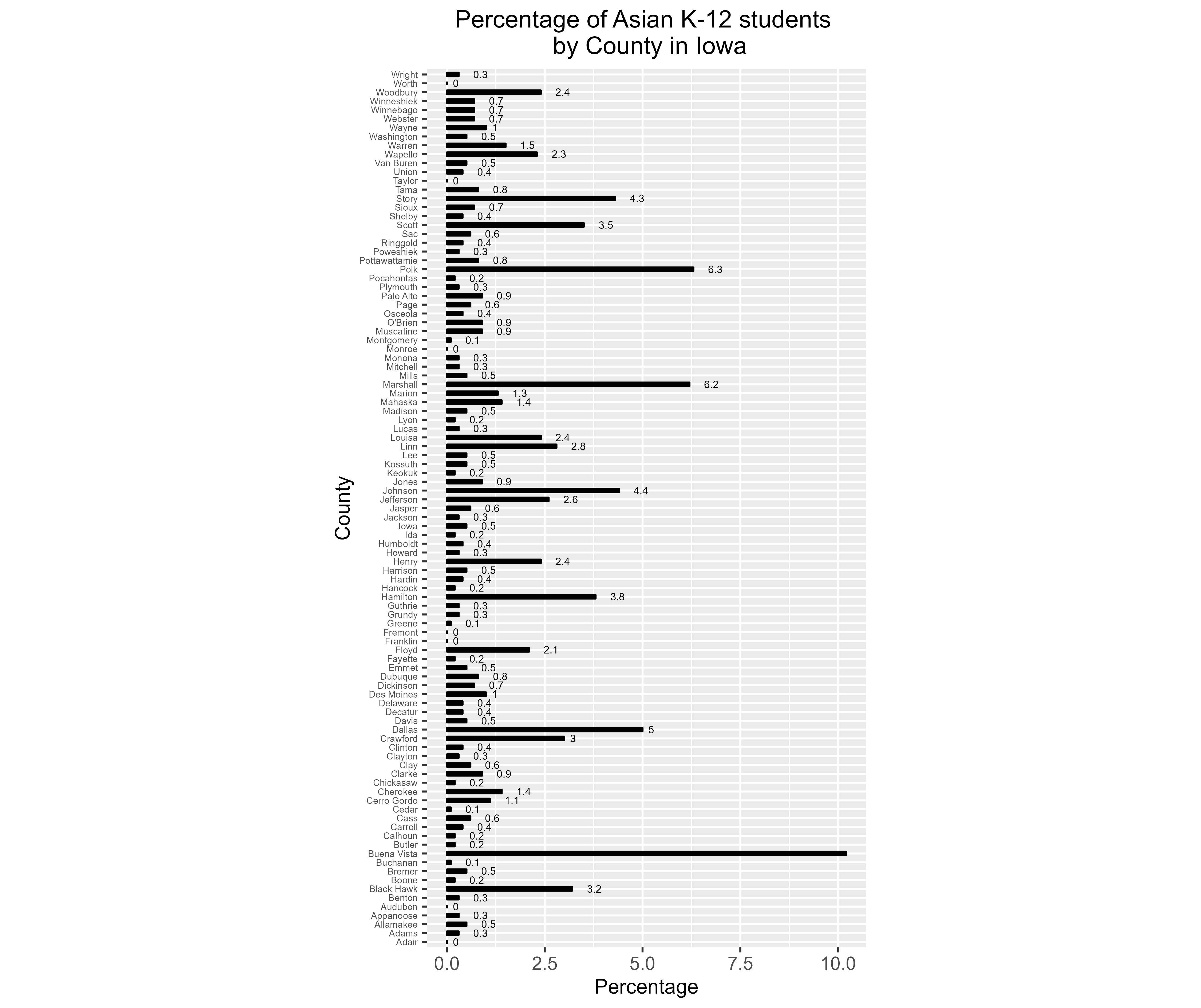
Using data sourced from the Iowa Department of Education, I downloaded student Enrollment data. I cleaned up the file in LA_558_Assign2.xlsx before bringing it into R, isolating Total K-12, AsianTotal, and BlackTotal by counties. Using the assign2.R with pipe function, I calculated the percentage of Asian K-12 students by county in Iowa. I plotted the resulting data on a bar chart using the ggplot.
2. Mapping Data in ArcGIS
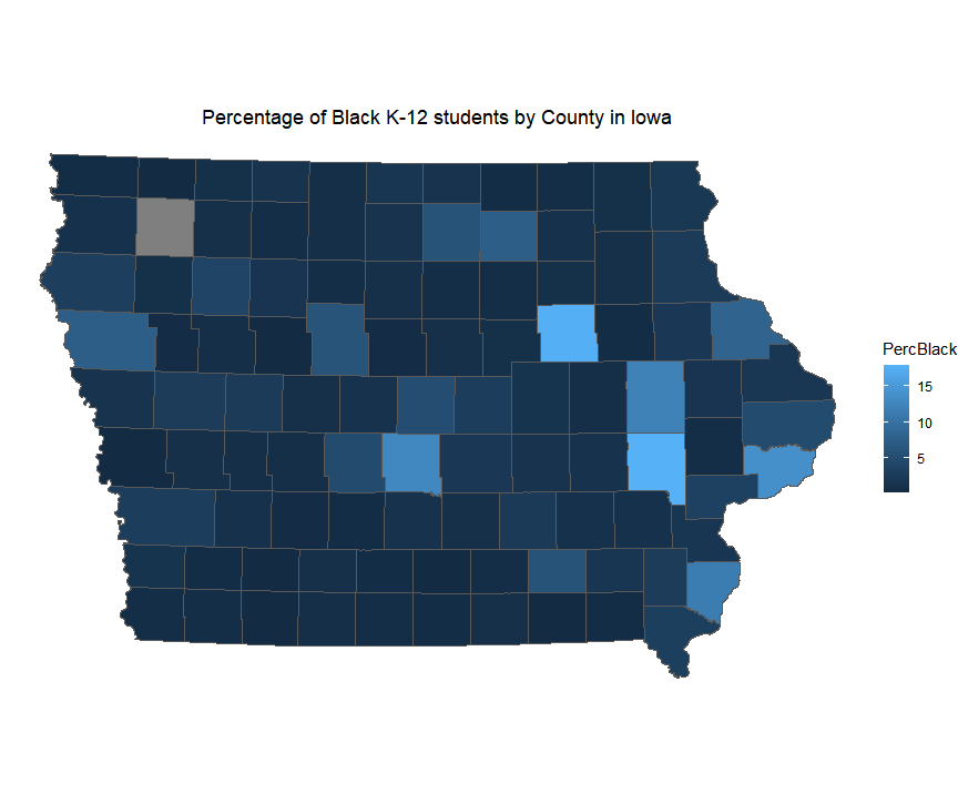
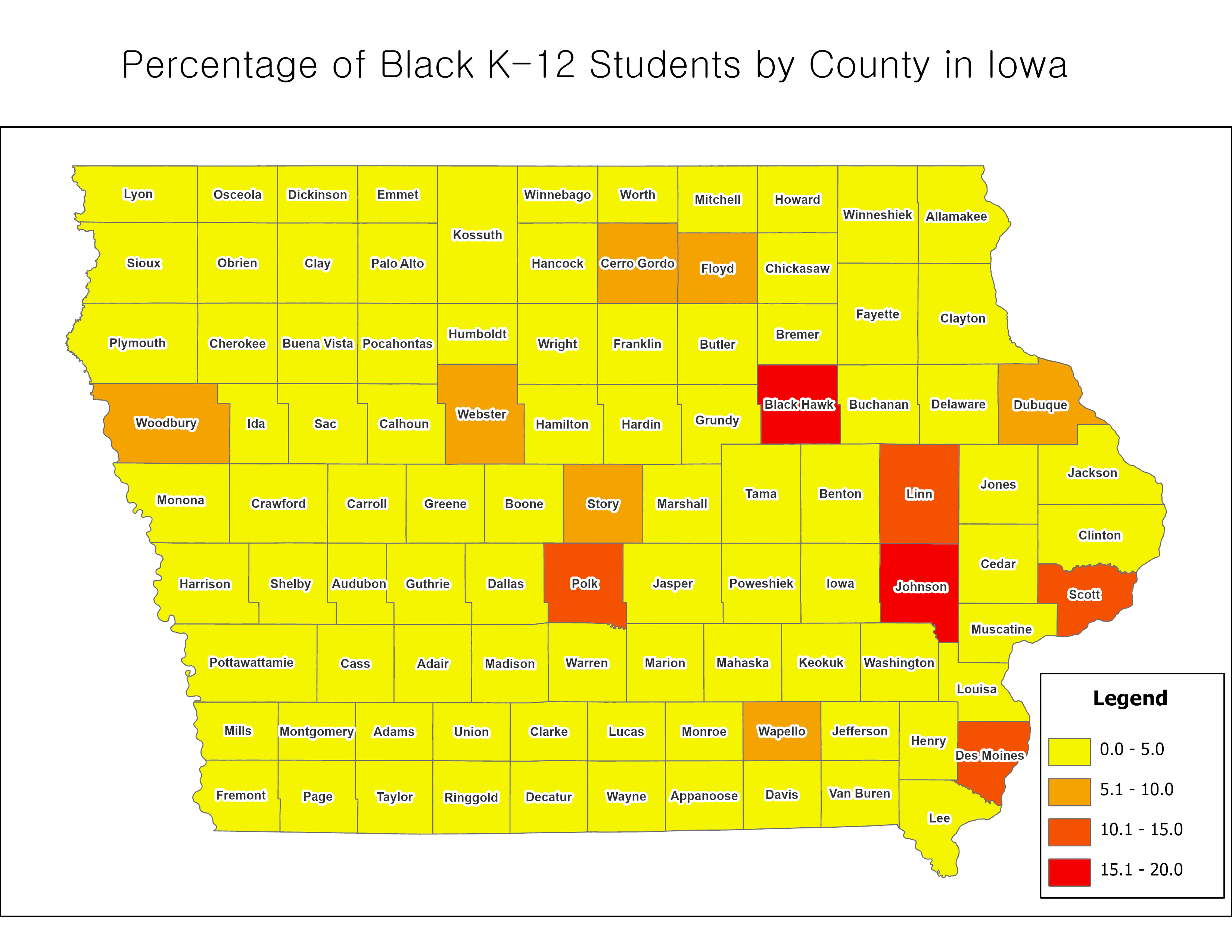
Also, I calculated percentage of Black K-12 students by county in Iowa with the same way used for Asians with R. And then, I exported the resulting data to Assign2_ForGIS.csv with the write.csv function. Using assign2.aprx in assign2 folder, I joined the table to “Iowa Counties” layer that I had. I finally made a map like below:
3. Mapping Data in R
The map below was created using the same dataset as the “2. Mapping Data in ArcGIS” above. Here, I then joined the data table to a shapefile of Iowa Counties (the one Professor Seeger had provided) after renaming the fields to match. Using ggplot in assign2.R, I mapped the data and exported it.